Tuesday, April 30, 2013

Illustration Friday founder says, "Farewell."

"Thank you and Good Luck Penelope!"
2013 Graphite and Digital.
Upon hearing the sad news that the Founder of Illustration Friday has decided to move on(see official announcement on IF's blog), I felt inspired to create a proper "Farewell" for Penelope Dullaghan.

You see Illustration Friday has been a stage which I've performed on for many years. The large audience, weekly topics, and strict deadlines were critical on many occasions, inspiring me to create when I wouldn't have otherwise. Aside from discovering countless amazing artists through I.F., the feedback I received from fellow illustrators gave a solid foundation for me to stand on when I first started out.  I can't thank the founder enough for creating and managing an amazing tool for as many years as she has.

I'm sure you would like to know that I.F. is not ending, Penelope is passing the torch onto another, I just hope that it keeps the same vitality, enthusiasm and support as it has for years before.

I wish I had time to color and finish the illustration above, but honestly I shouldn't have spent the time doing it in the first place! ^_^  ANyway, I have alot of great projects just over the horizon, so make sure to come back often!

Saturday, March 30, 2013

Poster and IPOD paintings (massive post)

MTC Poster. 2013
Graphite and Digital.

Sorry its been so long, but I've busy working on my NEW house! (see before and after Videos here.)  

Despite spending all of my time at home remodeling, I crammed as much art as I could everywhere else using my pocket sketchbook, and playing with colors on my ipod touch (more on that in a minute.) I've learned a lot that way, and it has given me time to reflect and focus on what matters most with my art (FE: no more distractions). I've also spent a lot of time planning and preparing for a large project that will consume most of this year. Still have a lot to go before I publicly announce it, but I am very excited. I havn't quite finished remodeling, but the end is very near.

On a funny note, since it HAS been two months without my computer, and without photoshop, I had a mild mountain to re-climb trying to remember some of the finer points of my digital techniques. It was surprising the things I forgot…but fortunately I regained enough to beat a deadline (the poster above.)


Detail of MTC poster. 
(click on the picture...to enlarge.)

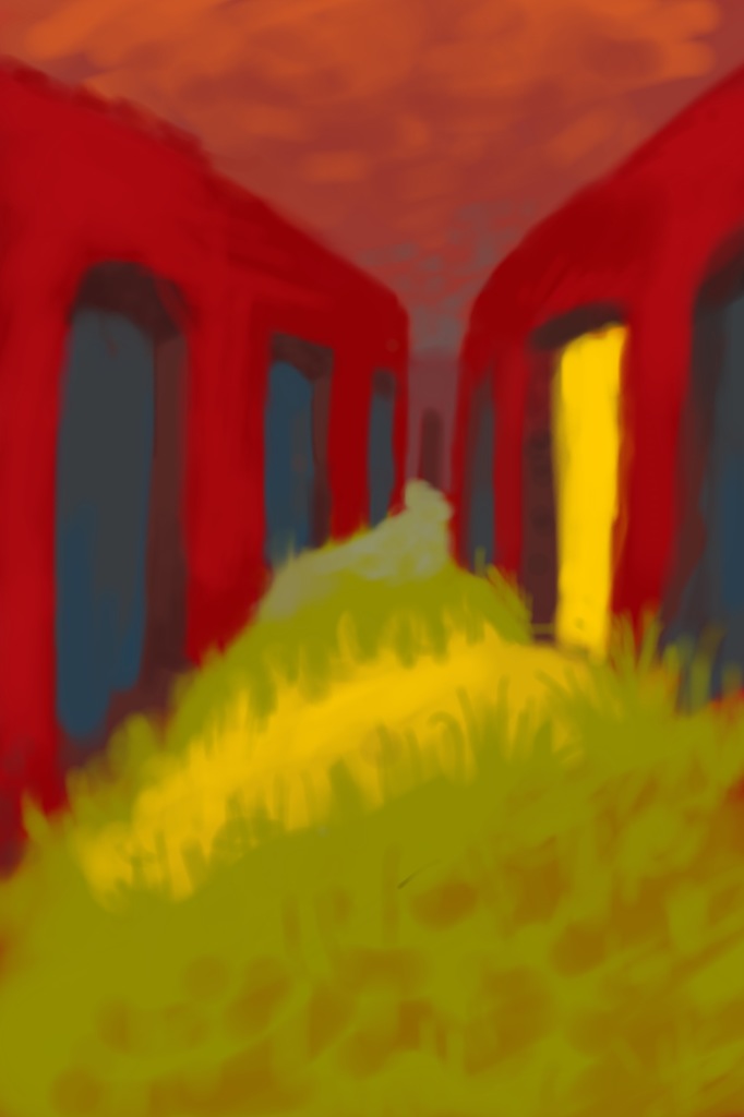
So as a bonus I wanted to include some of my IPOD paintings:
They are purely exploration, and fun. Sometimes from observation, sometimes contrived, & sometimes really random whims.
FYI: I use the program called SkethBook Mobile Version 2.7.1 (By AutoDesk).

As I mentioned earlier,  since I've been busy at home remodeling, I do art when I can.  The best time is when carpooling to and from work everyday. I was fortunate to have it where I never drive, and that means I get to paint whenever I want!  For example if traffic is really bad, instead of getting stressed about wasted time, I  paint! (Thanks Craig!)

Since I started these paintings I've noticed a huge improvement in my color theory. I've also found myself singling colors out in nature and falling in love with them and the relationship they have with colors around them.  This used to happen occasionally, but now it happens all of the time. Overall I am far more confident than I used to be, though I still feel like I know absolutely nothing. Sigh....

Now on to the PAINTINGS:   
FYI:They are in no particular order, and are only a selection from over 100 IPOD paintings I've made since Nov2012.


Well, what did you think?  I also hope you enjoyed my MASSIVE post today! haha ^_^

Thursday, January 10, 2013

Goodbye Portraits

 In May 2012 I started a full-time office job dealing with mortgages.  Up until then, for the previous 4 years, I had been working with the people pictured above!  I just finished these portraits today as  a "Goodbye." Hope you enjoy!

As an FYI, I am gearing up for two big projects in 2013. One is moving into and fixing up the house my wife and I are getting, and the other is illustration related.  If all goes as planned on the house, I should be underway on the illustration project in March...and boy is it going to be AMAZING!

Thursday, December 27, 2012

Christmas 2012 & Vacation RESET


CHRISTMAS 2012~
For the past few months I've been working  on a special Christmas gift for my wife...I can finally reveal it! My wife has been keeping a blog for longer than we've been married and I have wanted to contribute for awhile now.  Included below is 3 of 18 illustrations I created to supplement her blog posts and photos.  Follow this link  to view the rest: 


(Btw the picture of the crowded room is my front room...and if you look in the right hand side you might be able to see me in my studio/office. yah....needless to say my wife and I are VERY excited about finally signing the Purchase Contract on the house pictured above. LOTS more room!)


 Vacation RESET~
Earlier this month I packed my family up and we went on a week long trip away from home. This trip was needed since it had been about 8months since I started my full-time office job. I didn't realize it, but I was going stir crazy and needed a RESET. Aside from visiting family and experiencing "THe Art Institute" of Chicago for the first time, I wasn't expecting to get much else from the trip, but the quiet and relaxing time gave me time to look at life from a different perspective.

Some of the perspective change was due to experimenting I did during some down-time with some basic art supplies I packed. I found myself pushing boudries, and having a great time (and yes...without my precious technology!)  The rest of the post is some of what I walked away with...So Enjoy!

"New QUICK process"
2012  Sketch

  1. Concept: Come up with a basic/vague idea.
  2. Development: Strings/specific facts, thumbnails, compositional experiments/decisions. (basically these will be your guide at all times.)
  3. Vague Notion: Draw vague notion of composition lightly.
  4. Clarify some of the vaguness. 
  5. Solidify: make structure solid, hit value boldly, and clarify details more.
  6. Trace Lightly onto final paper.
  7. Let Watercolor do most of the final details. Then go in with Colored pencils.
  8. Finalize all details with regular pencil. FINAL. DONE.
Here is a more complete example (I actually did this on my trip, in my sketchbook):
"Tea-time Catasrophe"
2012 Sketch
 After this point, I am going to try and make a finalized pencil sketch or monotone watercolor  painting based on it and more strings/research I make...then scan it in, edit it and color in photoshop (Like some of my older illustrations.)


My personal illustration creed for 2013 (New Years resolution? ) :
      Through the hands of angels... some Art, Music, Stories, is delivered straight from heaven to lift up, inspire, and strengthen the human race. 

     These angels are normal people like you and me, except they took their talents and spent years perfecting it in order to bring happiness to others. 

     I want to be one of those people, which means I need to lift my sites higher, and not tread through the increasingly empty wastelands of mediocrity and self gratification.


Saturday, October 27, 2012

IF - HAUNT

"Haunting of Mary"
Digital 2012.
Don't ask why, but Halloween is  my favorite holiday...so I had to break from my busy schedule to express it. Perhaps it is the Fall season, or chidren dressing up,  exploring big old houses, and ancient graveyards or...Sigh....the list goes on.

Sorry for my long absence. I've been going throug a "find myself" stage and as part of it am working on a large project. I wont post anything else about it until it is done, but you can see the progress I've made in my illustration abilities above. ^_^ In addition to that project I am in the process of purchasing and fixing up a HOUSE!  Yay!  So what I am saying is that my blog might get a little neglected for a bit.


ILLUSTRATION PROCESS STUFF:

For this piece I approached it much like with acrylics, where I kept a pretty strict palette (see below on left) and tried as much as possible to work only from it (the picture is actually not complete. I had more mixed up colors in the bottom left, but forgot to save it.) Enjoy the short animation of my painting process (below on right).


Tuesday, August 28, 2012

IF- Tall

"Little Jack" 2012
4.25x 6.25 Watercolor, Graphite and Digital.

I can't begin to tell you how happy I am right now!  From concept to finish this illustration took about 5 hours, but that's not entirely why I am excited.  Basically instead of spending hours finalizing my sketch and having to painstakingly transfer it to watercolor paper, I CUT the middle-man out!


Normally I render a detailed/solid drawing, and then transfer it to watercolor paper. I HATE doing it that way because I feel like a machine cranking out a duplicate that usually stinks in comparison to the original.

For this illustration,  I printed my rough sketch off (pictured left) and with a light table began my final sketch ON the watercolor paper.  I started with a blue colored pencil, then finished the drawing with a .9 graphite mechanical pencil.  After that the whole composition came together using a combination of Watercolor, colored pencils, and digital techniques.

Saturday, August 18, 2012

IF- Teacher


On my way to wok I was thinking of an idea for an illustration...a teacher popped into my mind. I thought to brush it off until I found out that Illustration Friday's topic was "TEACHER" haha! So i hope you enjoy.

Thanks to Dan dos Santos and his recent posts over at Muddy Colors (link available at bottom of post) I made a HUGE breakthrough in one one of my greatest weaknesses...Value and color structure.  To be quite specific it is structure in complex environment based illustrations...for example if you look at the portrait below I find those type of things easy because it has only 2 layers of depth: Foreground and Background. The trouble occurs when I add a third layer Foreground, Middleground, and Background.  I tend to lose control of the illustration's structure.


Which is why I found Dan dos Santos post so helpful. He summarized value and color structure in 3 basic degrees or steps that all illustrations can be built off of. Some illustrators (such as Andrew Loomis) have more.  The 3 degrees or steps for each are as follows...

VALUE: White, Grey, Black. 
COLOR: Warm, Neutral, COOL.  

You use one per each of the depth layers (Foreground, Middleground, and background). I can't say I've mastered any of these to my satisfaction, but I feel much more confident in designing a complex composition. See my thumbnails, color palette and 3 degrees for value and color  below:


Oh yah...this past week something special happened...


You guessed it...I doubled the amount of kids I have!


Isn't he a keeper?


Dan dos Santos @ Muddy Colors: