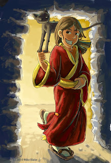
 If you couldn't tell this is NOT part of my project for my Digital illustration class. In fact it was only supposed to be a warm-up exercies, so to speak, for my ACTUAL illustration, but i got sidetracked, and thought this might be helpful after-all.
For the whole piece I utilized 3 basic techniques:
- For developing an idea and strengthening it... I utilized a technique from a professional artist named, Yoshitoshi Abe. He is a favorite Japanese artist of mine (Creator of "Serial Experiments Lain", and "Nie_7"). I first saw the technique I want to focus on utilized here by him: http://drawr.net/show.php?id=702962 The basic technique is to make an initial sketch, then overlay and fade the lines with a solid color wash. After the lines are faded let the imagination take hold, and break away from the drawn lines, by sketching over them. Repeat washes and sketches until satisfied.
- To further develop lines/shapes...I utilized a technique that I have been developing, and that is to do 3 complete sketches over the top of the each other. Essentially I utilize layers to trace over my old sketches, and as I do I make corrections. (if I don't get what I want after three tries, I do it more.)
- Finally for the coloring, I utilized another favorite artist of mine, Omar Dogan. For the technique I referred to http://omar-dogan.deviantart.com/art/Colouring-Tutorial-72826280 for most of my process. The basic idea was to start working on the background, mostly finish it, and once the overall mood was established, mask the character off, add black shading, add flat colors for each and every color, then play with Color Balance on the shading layer until viola..it is done. I've tried this before, but I've come along ways since then. Suddenly I've discovered a use for COLOR BALANCE!
So now that I just spent 4 1/2 hours being sidetracked...now on to my REAL project... :P (geez i love summer.)

No comments:
Post a Comment