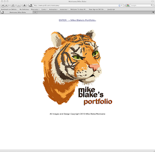
My Final Project: (my website and blog update)

http://www.jerbl.com/monisawa/
Since I already had plans to update my current web-page, I utilized this class as motivation. As I started on trying to make changes, i got frustrated and ended up replacing my entire site. I don't think a single shred of my old one is left (even the images.) It seems that whenever I update I start all over. I left my old web-page up if anyone is curious: http://www.jerbl.com/monisawa/old-monisawa/
My focus on the new website design was absolute simplicity and being seamless. I also made sure to organize it in such a fashion where future updates and changes are easy (in order to avoid my massive overhauls.)
As a bonus I found myself modifying several images that I made over the past year or so for the gallery and other webpage elements. Utilizing what I learned in this class and last semester, I was able to really spruce/fix them up.
In a portfolio it should house your best work. I have heard that I need to have 100% confidence with every picture, if not they do not belong. If this was true i would never assemble a portfolio, so I use what I have. In order to avoid putting every 'good' picture I've ever made in the gallery, I really focused on getting the cream of the crop in. Even with that in mind, i think that 2 or 3 of my illustration might get removed. Any recommendations/Thoughts?
As part of my final I also revamped my blog design. I really had no clue how terrible of a set-up it was! haha. I even absent minded-ly took a screen-shot of it for this post because I liked the changes so much...
Please make any suggestions about my website and blog.
Class Reflective::
-What I learned in this class:
- Giving critiques and analyzing peer illustrations helped me develop my own. (By seeing what worked and didn't work, and then explaining in words why.) I really appreciated anyone who commented on my pictures, they helped me understand my art better. Also thanks everyone for letting me critique/comment on yours! ^_^
- Finding illustrations I liked and asking myself why, helped my work develop.
- how to more effectively control the overall value, color and texture of an illustration digitally. (such as masks, color balance, hue/saturation, etc.)
- more about brushes than I ever thought possible (brush-directional, texturized painting, etc)
- Learning isn't necessarily in a classroom. The internet is a great resource for both tutorial and artist emulation.
- I spent most of my life just DOING art, now I am spending it trying to understand WHY, and how to present it BETTER.
- Doing master-studies builds a deeper appreciate and respect for the artist and their work. They just come alive.
- Writing out my own artistic process helps me better understand myself and how to prepare for future illustrations.
-How will I continue to incorperate the new processes I learned/discoverd in this class?
- Artist emulation is very useful and I plan to continue using it. From now on I will try to emulate some new element (style, process, technique...etc) in all my future illustrations.
- I will also continue to use, and practice using, what I learned in this class. I will also refer back to our blog entries as needed.
-How do I plan on marketing myself better?
- Once I get my website and portfolio stapled down (more professional) I will join more organizations and portfolio groups.
- My website/blog philosophy: my webpage will be strictly a professional portfolio. updates will only be new illustrations I feel worthy to make it on. My blog will be a semi-formal place where I can blab/get advice from others/and enjoy myself. I plan on keeping all my posts relative to art. I did make sure to keep it simple so that when possible clients/agents visit it will be easy to navigate.

Sounds like a good plan. The website seems to work well. Though I really don't like having intro pages. On your site it takes 3 clicks to look at any work. It would be best to cut out two of those pages from the front. As soon as someone enters your URL they should be on an enlarged view of your best piece inside one of the portfolios you have. Your navigation at the top would help them get wherever they want from there. Thanks for taking the class and keep the blogging going.
ReplyDelete