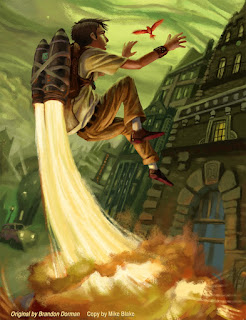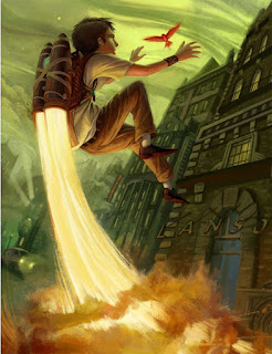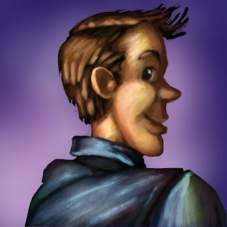

This being my last study for this class I decided to do something different, by just focusing on the study. I will say that I did at least 7 prep paintings before I got to this one. Some were of portions of the painting and others were me experimenting with the technique (I included one of my own at the bottom).
Artist: Brandon Dorman
Medium:Photoshop
Year: 20xx (not sure)
Source: http://www.brandondorman.com/ (although I got the actual high res pic from here.)
Title: Red Sparrow

1.Final sketch(step 1) 2.Shape flats(step 2) 3.Value (step 3)
4.Colors(step 5-8) 5.Final Sync (step 9).
- Sketches. Utilizing the grid system built into Photoshop , I loosely mapped out the picture. Once I got the basics established I turned them off. I did 2-3 more sketches after that.
- Shape Layers. Breaking the picture into layers (3 to be exact), I block in each main section(such as the boy, the background, and the fire/smoke). Turned the lines off, while utilizing the generic brush, and eraser (spacing turned on 1%) I reestablish the shapes looking specifically right now at the contours. I made sure to leave some space for painterly parts (such as the hair), although I did erase/cut-in more later. After that I break the shapes down even further utilizing greyscale colors, while keeping like colors together (such as the skin.) this makes it easy to magic wand select it later.
- Value Layer. Next I selected all pixels on a given layer (such as the characters), make a new layer and begin to define value with the generic brush set on opacity pressure. Do this for each layer. I started zoomed out and general, then worked my way closer in until I eventually was at 100%/actual pixel size. (notice I did not do this for the bg...which I rather regretted later)
- Reestablish shape layers. Copy merge the value and shape together, and paste as a new layer. Next select all the pixels in this new layer, make a new layer and reestablished my value flats (since in my value process I corrected some of my proportions/boundaries.) Did this for my fire/smoke layer and Character layer.)
- Light Colors. Then I selected a color/section on one of the new value flat layers, went to the Hue/Saturation menu hit -c0lorize and adjusted this layer to the brightest bright of that color. Did that for all the colors on that layer, and the rest (including the Background).
- Dark colors. As I was doing step 5 I would utilized the selected portions of the page to also Hue/saturation-colorize my copy merged value layer. I would adjust it to the darkest dark of it's specific color (making sure that the brightest part of it would not be brighter than the colors on bright color layer.) (I did several tests of the coloring process before I worked on this picture...and it helped on my own pictures to drag the light and dark layers out from each other to compare as I adjust the colors)
- Mask Painting. Making sure the light color layer was above my colorized value/shape layer, I put a mask on it, filled the mask with pitch black, and then utilizing my brush (I call Llama. Discussed here.) I paint. I learned that instead of utilizing opacity options for this painting step, it was better to utilize different levels of greyscale. (this part was fun and 'nondestructive' as Mr. Babcock would call it.) I made sure to save pure white till the very end, or at least wisely use it.
- Further colors. Next I select all pixels in either layer, make a new layer and utilizing a brush I call "Babcock (one of the ones he taught/made for us) I add all the extra colors...and fix any that need it. I even decided to make a separate layer set on multiply for different color/painting effects (at least for the BG).
- Final Sync. Next I copy-merge and paste each group of layers individually (so they are still separate) and utilizing my Llama brush I tighten/sync everything together. In this step I also included the rogue brush strokes, and tiny unique colors. It is in this step that I also cut into the drawing with the eraser(if needed). After a bit of working on this step I decided to set my Llama brush on opacity pen pressure (in addition to the flow pen pressure) and got much better results..easy cover and color control. (as a side note I found myself constantly changing the brush size with the option button on my pen to create the painterly/diverse effect).
- That's about it.
The learned technique:
- Whether intentional to the artist or not I have discovered a new method of painting. Utilizing masks and greyscale, I can easily establish form and a painterly style. having my Llama brush set on "airbrush" and constantly changing brush sizes also helps.
- Compositionally he fit ALOT in his painting. By studying this I better understand how to do that. (also notice that he did not use proper perspective...manipulated his own, but yet it still looks amazing.)
Further notes:
- Color-Comps: So there you have it. i think that this coloring method is very useful when creating pictures from ones imagination, or very little reference. Of course if I was doing an original I would also do color-comps before coloring(which are 3-5 color reference tests/explorations). As a usual disclaimer, I did not use the eye dropper on his painting at all...I utilized the color technique described above, and the basic RGB palette.
- Brandon's Process? I feel that this process is somewhat close to Brandon Dorman's. Based on his Blog he generally has 3 different stages :sketches, greyscale paintings, and color paintings. So I personally feel that he utilizes his greyscale paintings as a base for color and then paints (as described above). I did email him and requested a higher quality image (preferably the original .psd) but he replied and said he was too busy right now.
- Crammed Spaces: I really have no clue how he fits so much in a tiny space. I've noticed that good writers and artists have the ability to cut out all the useless crap and cram condensed ideas/concepts into one story/picture. This is something I am working on. (It can be frustrating trying to figure how close you want the character...and if it IS close, it cuts into the background, or even the possibility of adding any other characters...etc. Oh well, that will come with practice and time.)
- Layer tango: I have had a hard time separating my painting into layers. I often will paint on the ones I am not supposed to because my random impulses to work on a different section. Doing this master-study helped me to see how to better organize my layers.
This was one of the last test paintings I did before I actually began work on the final masterstudy. It didn't plan it this way, but my wife came in while I was working on it and pointed out, "oh you're painting yourself?" haha! I had no clue.


Really nice Mike. I think you got the grittyness of the painting down well.
ReplyDeleteHey thanks Mike. ^_^ I really appreciate the comment!
ReplyDeleteThat was a great piece to copy. It really shows off a nice progression in your experiments up to date in texture and image quality. Well done!
ReplyDeleteWow, looks great. Agreed with Mike, you got the grittiness down for sure, and a really interesting coloring method. How come you didn't do Step 3 on the background? Just curious.
ReplyDeleteGreat job Mike~ I love the flames shooting out... very nice project
ReplyDeleteThanks for the comments everyone! I really enjoyed working on this project.
ReplyDeleteJessica-I say,"Sigh..." to your question. Not doing the 'value step' for the background was due to laziness. I honestly cared more for the character than the background. Though in the end it made my work much harder and tedious. X_x Self-defeating laziness... haha
Mike,
ReplyDeleteIf you are using this as your final for the class I still need you to write more of an evaluation/reflection on what you have learned and how you intend to incorporate newly discovered processes into your continued practice. Also some more description on how you will continue to use your portfolio site and blog to your best professional advantage would be nice info too.