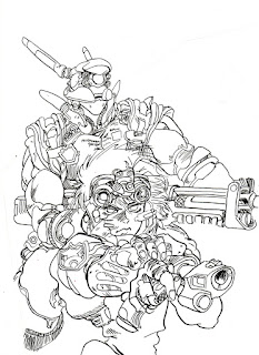
The Artist's original
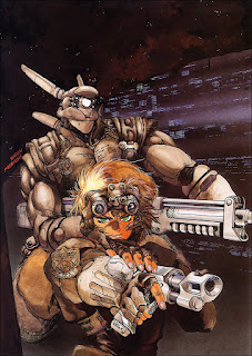
Masamune Shirow Day 1:
My original intent was to just focus on the linework, but fueled with excitment upon getting an article of his translated by a great friend, I decided to do the whole thing (though I will not be doing the background since I do not have an airbrush). I am doing this 100% traditional as you will soon see....
Artist: Masamune Shirow
Year: 1988
Source: Anywhere and everywhere all over the internet (like alot of Masamune's work...though his work tends to be questionable in content.)
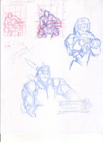
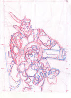
Process:
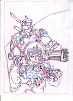
- Prepare: As you can see above, even though I am copying a picture I created thumbnails. I did that and exploratory sketches to better understand the composition and what to expect or prepare for. I discovered what was best was to break the characters down into general shapes, and then to start adding more and more detail. Considering this picture has ALOT of intricate details, I had to be careful since I could easily get lost looking at a tree, and get frustrated as the rest of the forest might not fit in the picture.
- The sketch: Next I start the sketch at the final size. TO save time I drew a light grid on my page and drew corresponding dots on the border of the printed master. From there I start general and light. As I increase in detail I also increase how hard I press the pencil against the paper. To start off i section the page off with angle-connecting lines, it was neat to see because some of them even connected at the several strategic points most likely set by the original artist. Eventually I try to get a few lines that are 95% absolutely correct so I can try to base other lines off of them and with that I start blocking the characters in utilizing general shapes. continue to sketch, sketch sketch.
- The sketch part 2: My original plan was to do all the sketching on one piece of paper, but because there was so many details and my paper was already pretty saturated with color, I ran a quick outline of blue, then utilizing my light-table traced it onto a new piece of paper. After that I did the rest of my sketches on it. I outlined the colored pencil with a 4B pencil.
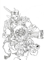
- The inked lines: Next i take my completed sketch, tape it to the back side of a sheet of Arches hot-pressed watercolor paper, trace the lines on the watercolor paper with a 4H pencil utilizing the light from my light-table. Finally I go back to my desk and begin to ink utilizing a pen and nib. (I am at a disadvantage with nibs, since I have not used them much, but I supposed this is one of the things I wanted to learn from this artist.) Once done erase the lines.
Problems:
- Either Masamune used a higher weight of paper, or a different one alltogether, because the ink did not exactly flow onto the paper as it did in the picture. It turned out fine, but I think the paper he used was a bit more slick.
- When I was inking the lines I found myself stuttering the lines, and I discovered that this was due to me trying to be too careful by following his picture (which because almost every line is intragal I basically had to do it). So because I wasn't responding to the medium correctly the ink didn't get applied correctly. Once I got to the more broad sweeping lines on the girl in the front, it got easier to stroke it instinctively, not just reacting to his picture.

Looks like watercolor to me. Lots of nice grain and reticulation. A good, but difficult thing to try in digital. Another option is to do a value study in watercolor and color digitally.
ReplyDelete...Though something about the smeary gristly-spotted textured washes seem different than watercolor...any thoughts? I did a test run with Artisan waterbased oil paints, and practically got pretty well the same effect...
ReplyDeleteMr. Babcock, I plan to do some digital elements...such as editing, and probably adding a general background, but I really want to paint it traditionally as he most likely did...
Very ambitious! I look forward to the colored version of yours..
ReplyDeleteAhh yesssss! Those Waterbased oils are great. I used some years back. All you need is a tube of black. It is like painting with a charcoal drawing. A great way to build up a value study to scan later. Try painting on a variety of surfaces: watercolor paper, smooth gessoed board, illustration board etc...
ReplyDelete