My version
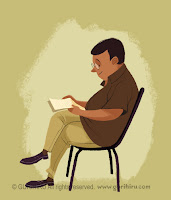
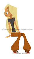
This particular masterstudy is not my typical...I started off doing one illustration (as I have in the past) but found myself realizing it wasn't what I wanted to learn, so I broadened my sights with the same artist! In order to fully understand (or at least as much as I could) I spent alot of time reseraching the style/process, and then began to make theories how it was accomplished digitally. What you see here in this entry is only the result of what I learned (so it is only 1/3 to 1/2 of what I actually did. haha)
My version (I based my sketch on the final drawing)
Artist: Gurihiru. (a pair of Japanese artists who work together under the same alias as comic artists, character designers, and illustrators. One does the layout,penciling, while the other does the coloring.)
Year: 2009-2010
Source: I found the images used spread over their English and Japanese blog:
http://gurihiru21.blog11.fc2.com/
http://gurihiru.blogspot.com/
The desired Technique: Understand how they do their quick paintings/studies. I've seen alot of artist depict character and personality in drawings, but Gurihiru does an incredible job at it. Just browse through their blogs and see what I mean!
Regardless i've been told that I need to simply some elements of my art...and I feel that what I learned will help alot.
My process (for all):
- Sketch: Do a sketch based on their final drawings. I did my sketches in 3 stages; sketch with red, then sketch with blue, and finally do a sketch with graphite. Note: I have noticed that some comic artists use blue and/or red pencils for preliminary drawings, where afterward use ink or pencil as the final step. (most use Prismacolor ColErase). Gurihiru also uses a mechanical pencil which uses 2mm lead. For the final pencil drawing I used 4B weight.

- Scan and clean sketch: Scan sketches in. Clean up by utilizing the Hue/Saturation feature and knock out the reds and blues (do this by putting saturation at -100 and brightness at 0.) Adjust levels to get rid of apper and 1/2 the noise.
- Add Background: make a bg layer that is just white.
- Color Lines: Select wand (with contiguous unchecked) all the white (try to leave as much grey and black linework as possible), invert the selection and turn the line layer opacity down. Make a new layer above and color the lines in. (this is especially helpful in getting the linework seperated from its white background.)
- Base Colors: Create a new layer and begin to slap colors down. Once get basic color down(jus the base colors) use magic wand and select each color, while utilizing the hue/saturation option. Click on the Colorize option and adjust each color individually.
- Shading: Make a new layer. Set the blend mode onto multiply. Then add shading wisely.

- Paint the shapes: Start a new layer and start painting. Basically we are trying to establish the actual shapes and get rid of the linework. Eventually turn off the linework.
- Paint-soften transitions: make a new layer and utilizing the eyedrop like before I use my painterly brush on 'Wet edges' option' to soften up some of the transitions.
- Erase/cut into shapes: Copy merge all the layers (except the lines) and past above everything. Go with the eraser (set on the same brush settings used in 7) and cut into the shapes. (make sure to turn off viewing all the other layers, but the one you are now working on...and the white bg.
- Paint-final linework: Make a new layer, move the line layer above it, turn the lineart opacity down (it's basically so you can add all the fine detail linework that we erased earlier) and begin doing the final linework.
- Finalize background: Add background elements. done

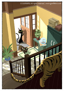
As a final bonus I am going to add the illustration that I ended up NOT doing and one of the things I focused on:
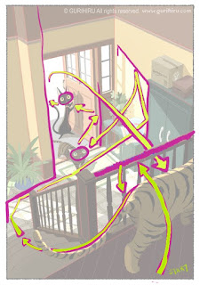
Visual pathways:
(before I changed my mind on what I was going to do for this masterstudy I spent alot of time breaking this picture apart...perspective, balance...etc. This was one of the elements I reaped from it.)
The first picture is the unhindered original..the bottom one
is how I depicted what I thought the visual pathway
through the picture might be. It is interesting to see and
to my surprise is very complex, and visually compelling.
is how I depicted what I thought the visual pathway
through the picture might be. It is interesting to see and
to my surprise is very complex, and visually compelling.


This is probably what happens to us in about 1-3 seconds:
1)start, 2)get stopped by Bannister, 3)reflect back onto tiger backside and travel down tail, 4)head down the stairs and get reflected by picture border and plant, 5)head towards next largest object, which is the cabinet, 6)travel up, but get caught by window light, 7)get thrown inbetween plant and fishbowl right at the cat's face, 8) get distracted by the next biggest object (the door), then go to the 2nd cat's face, 9) get led outside, 10) the white leads eye back into the picture, 11)FINALLY stop at the tiger and understand the whole picture.
Geez, now onto the next part...my original illustration...sigh. ^_^


Mike ~ thanks for your sharing your process. I really like reading all of your thoughts. I am also glad you added the blog links! Awesome stuff!
ReplyDeleteOne question. What do you consider your "paintly" brush? I was courious as to what it looks like? :)
Looking good!
ReplyDeleteOn your fine line-work I would highly recommend that you create a brush with the angle jitter turned up 100%, the smooth slick computer line doesn't mix with your richer textured shapes. I'll do a quick demo on that today.
Tifani- I'm glad that you enjoy reading my process (haha I spent like 1-1/2 hours on this one). Regarding my "painterly" brush, I will add that information as a comment to this thread once I get off work.
ReplyDeleteMr. Babcock- Thank you about the 'fine line-work'. I noticed that it did not fit, and nothing came to mind on how to fix it...
Thanks Mike I look forward to seeing it!
ReplyDeleteOk...I lied. I'm going to do another blog post tonight, with some practice drawings I am doing today...and I will put how to make each brush I used (including the one from this post.) Sorry.
ReplyDeleteWow!
ReplyDelete