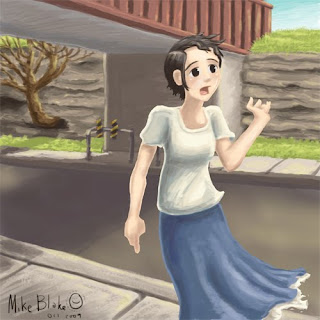
 Overall this was completely experimental. For the past few months I have been striving for a 'Painterly' style, and through some wandering and experimenting with different brushes in Photoshop Elements 6 (ya...I don't really have photoshop...what can I say, it was free.) this picture is what resulted. I was incredibly pleased as I could focus on the individual strokes of color and light, much like I do with real acrylics or gouache. I spent about 5-6 hours, from beginning to end, on this study.
Here is a run-through of all the things I did:
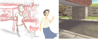
1)Sketch: Previously I had made a quick figure sketch of some random person at school and several days later decided to revisit and clean it up...But I did it completely in Photoshop. ()_() whoa! ESCAPE from the tyraany and regimen of scanned LINES! (both pencil and ink) haha **It is pictured above.
2)The Flats and Blobbify: Next I added all my flat colors inside the sketched lines, turned the line layer off and rounded out the shapes, and carved away into some of the shapes(what I call Blobbify). I also began this process with the background, but it ended up being a lot more loose...changed alot as it was half from memory and half made up, and then ended up doing step three directly on the flat blobs. :P haha
**It is pictured above.
3)Painting: This part of the process was my favorite! The whole picture came together in whirlwind of splashing colors. I tried to work very lose and fluid (keeping my wrist as much as possible off the wacom surface). I found a brush I really liked and for the most part stuck with it for the whole thing (though I ended up using 3-4 all together). Regarding colors I tried to keep them simple and realistic, while only using approx. 2-3 colors per flat color (Base color, Shade (and all its variance), and highlights.
The background was done independent of the character on a different layer. **pictured above. When it came time to paint the character I masked off the entire blob/flat, went to a new layer and began to paint, paint paint. (as most Japanese and American artists tend to NOT do, I wanted to emphasize less on the chest, and more on the face and the overall figure. :P haha! I think the figure has a very natural feel)
4)Finalize: This step ranges in every direction. Basically 'what ever the picture reaquires of you, DO IT!' Haha! For this picture I added more darks and lights to 'Push and Pull' the depth of the whole piece. Even just tiny dashes of light and dark can make or break a picture! ( I really shouldn't speak as if this was a masterpiece...it was a study afterall. ^_^ )
other notes:
-Original size 600dpi 1000x 1000 pixels(the 1000 is smaller than I usually work, but it kept the pixels simple and easy to see immediate results.)
-Part of what gave me the effect I wanted for the brush, was I clicked on the option for varying 'Oppacity.' Varying size was already selected, so with this added, it gave a beatiful painterly effect! Yea!
Honestly this started as a simple study, but branched out into a full on piece. ^_^ I am sure everyone should expect to see more pictures with this style incorporated in the future.

No comments:
Post a Comment