Thursday, February 13, 2014

ShinHan Poster Paint - Part 3 (of 3) "Using the Paint"

"The Wizard's House"
2014. Poster Paint 
ShinHan Poster Paint - Part 3 (of 3) "Using the Paint"


WORKSPACE:


 I spent time researching how professionals use Poster Paint, and also set up their workspace. Above is the basic configuration that I found to be mostly consistent.  
  • Open jars of poster paint (usually with the lids off. I decided against this when my paints started to thicken...though they are water-based and you can just add a little water and shake it up.)
  • several ceramic dishes for mixing paint in. (I used the trays above. The large one for areas I needed alot of color, and the smaller one for accent colors.) 
  • 1-2 containers of water (one for cleaning your brushes, and the other for adding water to your mixing area).
  • a cloth rag for blotting your brush (I used this quite often!)
  • Several brushes. (I currently stick with about 4-5...they are mostly flat brushes with a few round ones. Flat for large areas of color, and the round for detail work.) 
  • Paper. (I still am not sure what kind of paper they use.  It needs to be thick enough to take the water beating, but thin enough to absorb water and the paint. I'm currently using  90lb multi-media sketch paper. I probably should upgrade to a heavier weight....)
  • Reference pictures and sketches (usually taped or hung...I went with the digital aspect. )
  • Other things I found useful: spray bottle, propped up drawing board, scrap piece of paper for color testing, music, kids reaching up and trying to steal your brusshes...or tip your water, oh wait. skip that last one.

PROCESS:
"TheWizard's house," Animated progress (WARNING : Large 1 MB file).
  • I started with a detailed sketch, 
  • Then for this painting I decided to do something differently... After finishing the sketch, I reworked it digitally, added color, and printed it off on the final paper as an underpainting. (This saved alot of time resketching onto the finished paper, and helped approximate alot of the colors ahead of time.)
  • Then (Per tradition of Poster paint artists) I completely soaked both sides of the paper and laid it flat on the board. (This helps the paper absorb the paint, and helps the paint flow on smoothly.) See picture below(this is just the print-off wet) :  

  • The step above can also be used at any stage of painting, by soaking only the back, and then carefully turning it over and laying it flat. See picture below(this picture was my last day of painting):

  • Then while the water is only beginning to dry on the paper, add your atmospheric colors (color blending can be done in this step with practice.)  I chose to go with a solid color instead of gradients...so no stress for me.
  • Then as the water continues to dry work large to small and from the back of the composition forward. I decided to start with the building, then I did the background trees, then I worked on the foreground trees, and finished it all off with the grass, and structure up front. I basically finished each part and then moved forward, but this doesn't exlude me from re-working anything.
  • Various techniques can be accomplished when the paper is bone dry (such as scumbling, and some glazing), but be careful to not ruin your brushwork.

Anyway, I hope you guys have enjoyed these posts. I will continue to post new pictures with Poster paint as I complete them.  SO make sure to come back often!!!

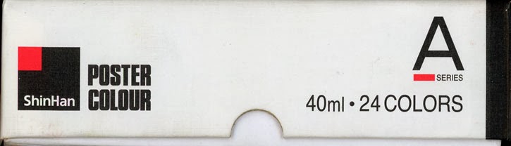
Bottom line for the last three posts, is that I love using ShinHan Poster paints. Please support POSTER PAINTS in the US!  Try a new medium and see why it is fun and easy!

Previous:

Previous

Keywords: Hayao Miyazaki, Ghibli, Poster paint, Color, Kazua Oga, animated movies, japan, anime

Tuesday, February 11, 2014

ShinHan Poster Paint - Part 2 (of 3) "My Review of the Paint."

"Having fun with Zinaida Serebriakova"
2014. Poster Paint


ShinHan Poster Paint - Part 2 (of 3)  "My Review of the Paint." 


So here is post two, my review of ShinHan's poster paint.

ASTOUNDING COLORS
When I first received  my set of Shinhan Poster Colours in the mail,  I pulled each color out of the sturdy case, stared at it, and then put it back.  After completing this, I did it again.  The colors are astounding and mesmerizing in the jar, and even more on paper.

The set I received had 24 colors, and I feel that it is more than enough to what I do.  Honestly the hardest part of painting with them is trying to tone done the pure vibrancy!

Below is what Shinhan has on their website for the selection of colors :
Decent selection of vibrant colors!
(http://www.shinhanart.co.kr/eng/product/product_poster.php)


USING THE PAINTS
My first thoughts when painting with Shinhan Poster Paints was...it was like painting with liquid gold. pure, beautiful colors, that paint on so smoothly.

I hardly noticed the difference between Nicker Poster Colour (What Kazuo Oga and Ghibli uses) to Shinhan Poster Colour.  They are both high quality and are extremely EASY to use.  Easy that is, once you learn the basic rules... (as explained below).

LEARNING THE RULES
My experience wasn't immediately easy. In the past I had succeeded using poster paints, because the paintings had been small (small to conserve paint...since the only way to get Poster paint in america was to fly to Japan or Korea and physically bring it back), but with a full set in hand and prospects of having a US based supplier, I wanted to work LARGE (well larger than 4x5).

Unfortunately, if I had learned anything in school, it is that working larger is also harder as it shows how much you know, or don't know.  So, I tried to treat the paint like acrylics or watercolors (which is my specialty for wet mediums), and then I tried Gouache, but found myself getting frustrated, and the paintings not turning out.

That's where the videos below came into play... After watching them I almost felt like a PRO (now mind you I can't understand what he is saying, but his actions speak louder than words for me. Note how he mixes, paints with the poster paint, and how he sets his studio up, and so on):


After watching the videos I quickly found myself producing better paintings with Poster paint then I ever got with acrylic (and to some extent digital.)


STRONG POINTS:

  • I would say one of the strongest points of the paint, is its vibrant colors and mix-ability.  The color options are limitless, while at the same time is also easy to get what you had previously.  If the paint on your palette dries, you can go back in and bring it to life, or add another color to get a variant, etc.
  • Another strong point is that it is very opaque and you can go layer  after layer over iteself.   Be warned however, you can use too many layers (see 4th Weaknesses below).
  • Another strong point is that it has defined edges. This is great for  trees, buildings, basically anything with hard edges. I love using hard edges on everything, so this really speaks to me.
  • It scans REALLY well. Matte finish, and color transferred decently with my Epson V600 scanner. (I only had to  use a few photoshop options.)
  • The paint is very fluid.
  • ...etc. I could go on.


WEAKNESSES(not very many in my book):

  • It is not very good at SMOOTH shifts of value or color.  The paint tends to give everthing a hard edge (as you can tell on the picture above, on her skin.) I was able to get a little scumbling in (look at the background), which is a dry-brush technique, but the paper has to be bone dry and the brush with hardly any paint or water.
  • Another thing it is not good for is glazing.  At several points on a recent painting, I wanted to slightly darken a whole area, but the moment the dried paint is wet, it reactivates the paint and smears and you lose all the details you worked on.  You can do glazing, but once again the paper has to be bone dry and your brush shouldn't have alot of water or paint.
  • Preservation?  I'm not sure the lasting value of using Poster paint. I  know Ghibli puts many of their backgronds on display, so maybe it is ok as long as the pictures are properly framed and humidity leves are kept in check? One thing is it would be good for illustration. Quick paintings that might or might not need to last.
  • Finally, be careful about using too much paint, because this happens:
Keywords: Hayao Miyazaki, Ghibli, Poster paint, Color, Kazua Oga, animated movies, japan, anime

Friday, February 07, 2014

ShinHan Poster Paint - Part 1 (of 3) "The Journey."

"A Small House"
2014. Poster Paint
Sorry for my absence on here. I've been pretty busy!  The most obvious thing is what this post is about! The others: (Started a webcomic in January called,"A Day in the Life") (I am in the process of COMPLETELY remodeling my kitchen) (I am also gearing up to finish my halloween special, "Bubbling Brew")  (Other of life's etc)... Anyway, now onto the MAIN event.


ShinHan Poster Paint - Part 1 (of 3) "The Journey." 


GHIBLI USES POSTER PAINTS
Awhile back, I made a post  about how Ghibli, a famous animation company in Japan, uses Poster Paints to do their background art. At the time I thought, "The stuff you paint on windows, or smear your hands in...is a fine-art tool?" This confusion led to curiosity and I set out to buy the nicest set of poster paints I could find.  This I discovered was harder than I realized and I found myself spending a measly $9 for a set that looked like crap.  Once I got it home,  I discovered that sure enough, they were crap.

POSTER PAINTS FLAMMABLE?
Doing a little more research, I found out that the quality of poster paints used by Ghibli, was not available in the U.S.  I also found that I could not purchase them online, for example I found the same brand Ghibli uses (Nicker Poster Colour) on Amazon Japan, but they would not ship it overseaas due to something about, "flammable contents."(I'm still not sure how a water-based medium was flammable...) I desperately wanted to use the tools of the trade used by the masters I so admired, but I was at a dead end.

KAZUO OGA USES POSTER PAINT
Using what I had available in the U.S. (Acrylics, watercolor, Gouache, etc ) I attempted to emulate, Kazuo Oga's work (see some examples of his work below), but only Gouache came close, and I found it frustrating to use (which is strange because I love watercolor).  

Kazuo Oga is the lead background painter
 for many of Ghibli movies, and especially famous 
for his work on Hayao Miyazaki's, "My Neighbor Totoro."

FIRST EXPERIENCE USING PRO POSTER PAINT
This is where Maho, a great friend of mine, stepped in by sending a mysterious package in the mail. Part of it was an amazing hand drawn card, celebrating the birth of my first son, and the other was an actual set of Nicker Poster colours!  I immediately broke the paints out and began to paint.  They were like nothing I had ever used before. At the time I stated the they have a, "creamy flow and coverage, which seems like a mixture between acrylic and goache."  I really enjoyed them, but since they were rare to come by, and the set was so small, I dared not use them often, or get too hopelessly attached.

SHINHAN ART AND PRO POSTER PAINT IN U.S.
Fast forward to 2014, when I received an unexpected email from the President of the U.S. branch of Shinhan Art (http://www.shinhanart.co.kr/)!  In the email, he quickly explained that he found my blog post about Poster Paint and that his company was expanding their current selection of art tools to include professional grade poster paint! I couldn't believe it.  Not only that, but he was willing to send some samples!

FREE SAMPLES=CREATE ARTWORK
We then set up a time to talk on the phone, he called, and after a very cordial conversation...and a few days later...I found a full set of Artist grade Poster colours on my doorstep!!!  Of course I didn't exactly get them for free, my part of the deal was that I HAD to use them and create ARTWORK that I would share.   Um...using poster paint...and creating artwork and sharing it...sounds like a WIN, WIN, in my book!

So for today's post, and many in the future (until I run out of paint), I am highlighting POSTER PAINT / POSTER COLOUR as a FINE ART TOOL!!!!


Next time: "